


Everyone’s heard the age old adage, "keep it simple stupid". Well when it comes to landscape photography, it’s not so much an instruction as a challenge! In a lot of locations (particularly tourist hotspots) it can be much, much harder to create clean and simple images. This article explains my thought process when it comes to creating compelling landscapes, as well as some practical and post-production tips that help along the way.
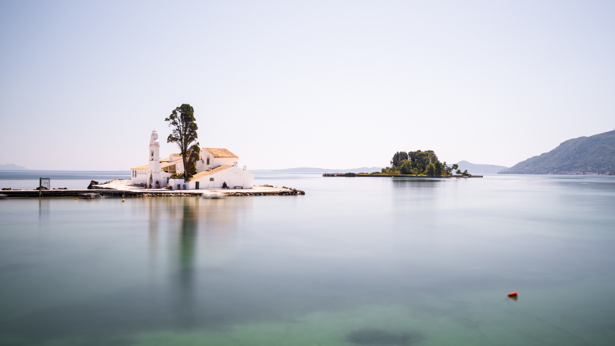
Okay, deep breath, here’s the raw image:

1 - Identify your subject(s)
Well that’s straight forward enough - it’s the monastery right?
Well yes, but there’s a bit more to it. Anyone can take a snapshot of the Vlacherna Monastery in Corfu and spin you a yarn about its history, significance and geographical peculiarity. But when all you have at your disposal is a two dimensional image, it helps to be really clear about exactly what you want to communicate to the viewer, so that you can make decisions about how to do it.
The subjects of an image are often very personal. You may take something away from an image that is very different to the next person, or even from the photographer herself. The subject of a photo can be, well, pretty much anything at all. You might want to show off an object or structure, a person or animal, a colour, a compositional technique, a visual narrative, or even a mood or atmosphere (just to name a few things!).
For me, the above image is also about:
- the surreal location;
- the feelings of isolation and contemplation; and
- the general tranquility of the scene.
This may sound a bit pretentious (it probably is), but as I said above, being sure as to what your photo is about, will make communicating it much easier.
2 - Showcase your subject(s)
Now here’s where it gets a bit more complicated. Some images may require a lot of work, both in-camera and in post-processing to make your intentions clear. Others will be essentially ready to go as soon as you release the shutter. Mediating between the reality of the scene and your own artistic vision is also often a very hard line to toe, and this is a call that only you can make. There’s also no one-size-fits-all approach to making your subjects stand out, so I’d recommend trying as many different strategies/techniques as you can and figuring out what works for you.
Here's the image again, this time with a crop and corrections applied.

These are are some of the techniques I used in-camera to simplify the visual story of this image:
Composition - framing and focal length
There’s nothing more tranquil than large bodies of still water. It’s definitely a cliché at this point. For this shot I positioned my camera in a way that maximised the water in the foreground and zoomed in slightly to 35mm to remove some distractions at the corners of the scene (see the links below for information on the Sony gear I used).
Composition - symmetry
On this day, the smooth water mirrored the largely empty sky and worked to balance the image. For this reason I positioned the horizon at the vertical midpoint of the image. Had the sky been full of dark, dramatic clouds, the composition may have been more heavily weighted towards the sky. There is also some horizontal symmetry between the two islands in the scene, which are both placed approximately on the horizontal third lines - again this helps to balance the image.
Long exposure
I knew on arrival that I wanted to minimise the number of people in the image - a building swarming with tourists doesn't exactly work with the narrative of solemn worship I was going for. To help achieve this, I combined several long exposures of around 60 seconds. With such a long exposure time, moving objects (including people) tend to becomes semi-transparent or even disappear completely. Only figures that stay in one place register fully.
Note: to achieve this effect during the middle of the day, you will require a strong neutral density filter (in this case 10 stops) combined with closing down the aperture in your lens (in this case f/14).
3 - Simplify your image and remove distractions
Okay now that your subjects are popping, lets remove or minimise anything else in the frame that’s either sending a conflicting message or drawing the viewer’s eyes away from the stars of the show.
This can be done practically by physically altering the scene and/or changing your composition, however this isn't always possible. In terms of what can be done in post, with today’s editing software you can really take it to the extreme and entirely recast your image. This is both a good and bad thing. When starting out, I would err on the side of caution and keep it natural.
In this image, even with the long exposure stacking technique discussed above, there were still some traces of people moving about the island that I was keen to minimise. I used a combination of spot removal, content aware fill, and the stamp and patch tools for this image.
Before:

After:

And the final image:

Final thoughts
It’s very easy to let the power of editing tools go to your head. It’s just as important to know when to shutdown Photoshop and just hit export. In this case, I did not remove:
- The red buoy in the foreground - I feel it adds to compositional balance and creates depth in the scene (but it was very close to getting the chop!).
- The man sitting on the bench on the near side of the monastery - the idea of a solitary sitting figure very much works with the subjects of isolation and tranquility. He also didn't move for about 30 minutes, so he earned his keep.
- The pathway connecting the monastery to the mainland - even though this would have accentuated both the surreal nature of the scene and the feeling of isolation, in my view, it would have altered the integrity of the image too much.
Remember that for every "rule" there is an exception. Busy images rich in detail, texture and complexity can of course be stunning too, so keep your eyes open!
Connect with me on Instagram, Facebook or on my website and let me know your thoughts!


